Mar 2023
GifTV
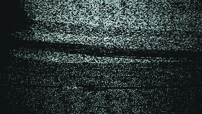
Here I explore making a simulated retro tv with some animated gifs from a few of my favorite movies.
<html>
  <head>
    <meta name="viewport" content="width=device-width, initial-scale=1.0, maximum-scale=1.0, user-scalable=no">
    <meta charset="utf-8">
    <link rel="preload" href="righteous.ttf" as="font" type="font/ttf">
    <link rel="preload" href="permanent-marker.ttf" as="font" type="font/ttf">
    <style media="screen">
      @font-face { font-family: "Righteous"; src: url(righteous.ttf); }
      @font-face { font-family: "Permanent Marker"; src: url(permanent-marker.ttf); }
      html,body { margin: 0; padding: 0; font-family: system-ui; font-size: 14px; line-height: 26px; height: 100%; width: 100%; }
      body { background: #1a1a1a; }
      #root { cursor: pointer; display: block; height: 350px; }
      #logo { z-index: 6; position: absolute; bottom: 30px; right: 60px; line-height: 1; font-size: 70px; color: #fff; }
      .gif { font-family: "Righteous"; position: relative; z-index: 1; -webkit-text-fill-color: transparent; -webkit-text-stroke: 0.1px #f1f1f1; -webkit-background-clip: text; background-image: -webkit-linear-gradient(#C3BFB4 0%, #FDFCFA 50%, #E8E7E5 51%, #757172 52%, #E8E9DB 100%); -webkit-filter: drop-shadow(2px 2px 15px #3F59F4); }
      .tv { font-family: "Permanent Marker"; font-size: 40px; width: 52px; position: relative; z-index: 1; display: inline-block; -webkit-transform: skew(-15deg,-15deg); background-image: -webkit-linear-gradient(#FF0FF8 0%,  #F9F9F7 100%); -webkit-background-clip: text; -webkit-text-fill-color: transparent; -webkit-filter: drop-shadow(2px 2px 20px #f008b7); }
      #root img { display: block; width: 100vw; height: 100vh; object-fit: cover; }
      .image-container { z-index: 1; position: absolute; top: 0; right: 0; bottom: 0; left: 0; }
      .filter {  transition: opacity 0.5s ease-out; background-position: left top; position: absolute; top: 0; right: 0; bottom: 0; left: 0; }
      .filter.noise { z-index: 2; background-image: url(noise.gif); background-size: cover; mix-blend-mode: hard-light; opacity: 1; }
      .filter.scanlines-a { z-index: 3; background-image: url(rgb-scanlines.png); background-size: auto; mix-blend-mode: overlay; opacity: 0.2 }
      .filter.scanlines-b { z-index: 4; background-image: url(rgb-scanlines-black.png); background-size: auto; mix-blend-mode: overlay; opacity: 1 }
      .filter.scanlines-c { z-index: 5; background-image: url(rgb-scanlines-black.png); background-size: auto; mix-blend-mode: darken; opacity: 1 }
    </style>
    <script type="text/javascript">
      const createNode = (options) => {
        const node = document.createElement(options.tag);
        if(options.className) node.setAttribute('class',options.className);
        if(options.innerHTML) node.innerHTML = options.innerHTML;
        if(options.attributes) Object.keys(options.attributes).forEach(key => node.setAttribute(key,options.attributes[key]) );
        if(options.style) Object.keys(options.style).forEach(key => node.style[key] = options.style[key]);
        if(options.event_listeners) Object.keys(options.event_listeners).forEach(key => node.addEventListener(key,options.event_listeners[key]) )
        options.root.appendChild(node);
        return node;
      }
      class App {
        constructor(){
          document.addEventListener('DOMContentLoaded',this.init.bind(this));
          document.addEventListener('click',this.handleDocumentClick.bind(this));
          this.images = [
            { url: 'terminator.gif', duration: 1500 },
            { url: 'bladerunner.gif', duration: 3500 },
            { url: 'fifth-element.gif', duration: 2300 },
            { url: 'abyss.gif', duration: 2400 },
            { url: 'blind-fury.gif', duration: 1800 },
            { url: 'predator.gif', duration: 1600 },
            { url: 'indiana-jones.gif', duration: 1300 },
            { url: 'jurassic-park.gif', duration: 4000 },
          ]
          this.current_image = null;
          this.timeout_next = null;
          this.timeout_noise = null;
          this.els = {};
        }
        init(){
          this.root = document.getElementById('root');
          this.els.logo = createNode({ root: this.root, tag: 'div', attributes: { id: 'logo' }, innerHTML: `<span class="gif">GIF</span><span class="tv">TV</span>` })
          this.els.image_container = createNode({ root: this.root, tag: 'div', attributes: { class: 'image-container' } });
          this.els.noise = createNode({ root: this.root, tag: 'div', attributes: { class: 'filter noise' } });
          this.els.scanlines_a = createNode({ root: this.root, tag: 'div', attributes: { class: 'filter scanlines-a' } });
          this.els.scanlines_b = createNode({ root: this.root, tag: 'div', attributes: { class: 'filter scanlines-b' } });
          this.els.scanlines_c = createNode({ root: this.root, tag: 'div', attributes: { class: 'filter scanlines-c' } });
          this.loadNext();
        }
        loadNext(){
          if(this.timeout_next) clearTimeout(this.timeout_next);
          if(this.timeout_noise) clearTimeout(this.timeout_noise);
          this.current_image = this.current_image === null || this.current_image + 1 === this.images.length ? 0 : this.current_image + 1;
          this.els.noise.style.opacity = 1;
          let image = new Image();
          image.onload = () => {
            this.timeout_noise = setTimeout(() => {
              this.els.noise.style.opacity = 0;
              this.timeout_next = setTimeout(() => { this.loadNext() }, this.images[this.current_image].duration - 500);
            }, 500)
            this.els.image_container.innerHTML = ``;
            this.els.image_container.appendChild(image);
          };
          // image.onerror = this.handleDocumentClick.bind(this);
          image.src = this.images[this.current_image].url;
        }
        handleDocumentClick(){
          this.loadNext();
        }
      }
      const app = new App();
    </script>
  </head>
  <body>
    <div id="root"></div>
  </body>
</html>
I first went looking for some animated gifs of cool scenes that I want to use on Google Images. I store the filenames for each and asynchronously load them for a specified duration, and a noise effect overlay is applied using mix-blend-mode while each image is waiting to load. I then added two extra overlays of a repeating background image for the CRT effect.
The logo uses two fonts from Google Fonts which are styled with CSS to achieve the retro logo effect.
Project Assets
| Asset | File | Description |
|---|---|---|
noise.gif |
Download | Noise image overlay |
rgb-scanlines-black.png |
Download | Black scanlines |
rgb-scanlines.png |
Download | RGB scanlines |
permanent-marker.ttf |
Source | Permanent Marker font |
righteous.ttf |
Source | Righteous font |